
Anytime - Friend Sharing App
human distance relationship product that gives users insights into their communication habits
ROLE
UX Researcher, UI Designer
TIME
Sep 2022 – May 2023
DELIVERABLES
Competitive analysis, Journey map, UI design, Flow chart, Interviews, Persona
TOOLS
Adobe Illustrator, Figma, Miro
Overview
BRIEF
According to research, our personal experiences and feelings are significantly influenced by the environment in which we live. Nevertheless, hearing about the travel experiences of friends can offer unique insights, presenting new activities and perspectives that may have otherwise gone unconsidered. Studies suggest that beyond personal experience, traveling satiates our inherent drive to learn and explore. However, the travel industry is heavily reliant on a network of systems, including hotels and restaurants, which can present challenges for travelers. In fact, nearly 79% of American travelers have reported experiencing at least one "travel-related problem." In light of this, I am deeply committed to improving travelers' ability to learn about and experience the cultures of the places they visit. To achieve this goal, I propose creating a tool that fosters deeper connections between travelers and the destinations they visit, making a valuable contribution to the travel industry.
Challenge
Problem Statement
How might we create an easy, efficient communication for friends who don't talk much and who don't have time in order to build a meaningful connection?
Research
Competitive Analysis
Limited audience.
Time limit
Useless content
Addictive
Fake security
Limitation of information
Geofilters
Large community for advertising
Know your viewer
Convenience
Social connection
Entertainment
Self-expression
Loss of privacy
Addiction
Time limit
Peer pressure
Good notification system
Editable text
Avatar
Easy access to photo
Apple only
Security issue through iCloud
Hard to organize message/inbox
“People need better organization when communication increased“
“People love short & convenient information“
“People care about the privacy and who can receive their messages“
User Interviews
INTERVIEW GOALS
I want to understand common challenges people have during the process of a long distance passive communication. Furthermore, I want to learn their behaviors and actions through out unique situations.
INTERVIEWEE
I interviewed eight students for this interview. They all has experienced or experiencing some type of long-distance relationship with their friends and families. These eight students are between 20 to 25 years old.
Behavior Analysis
Based on interview results, I organized them into related groups and analysis possible connections. From the results, it is clear that people are experiencing more conflicts when there is a lost of security. Furthermore, people think that having a face to face, or video call communication is more efficient, but also more time consuming.
Work/life balance
Individuals may feel less connected to those who are not present in their daily lives
Effort required
The pressure to maintain frequent contact with family members can cause stress or anxiety
Sharing/responding
Sharing daily activities with others is a key way to stay connected and maintain relationships.
Persona
DESIGN PRINCIPLES
DESIGN PRINCIPLES
In order to design more user-centered, seamless and effortless experience of making connection with friends, I analyzed what I concluded in the user research, and developed key design principles into three main features.
IDEATION
Initial Ideas
Photo Package
The proposed concept involves the creation of a platform or application that enables individuals to easily share a curated collection of their daily photographs with friends, family, and acquaintances. With a simple click, users can compile a gift package of images, which can be sent to recipients who can then experience the joy of opening and discovering the contents.
One of the key advantages of this platform is the element of surprise it offers to both the sender and the receiver. This can evoke positive emotions and foster a sense of relaxation and enjoyment. The platform can be a unique and innovative way for people to connect and share their daily experiences with their loved ones.
To bring this idea to fruition, extensive research and planning are essential. Factors such as user experience, customization options, privacy, security, and revenue streams must be carefully considered and integrated into the platform's design. By adhering to professional standards and practices, this idea has the potential to become a successful and valuable addition to the photo-sharing landscape.

DESIGN
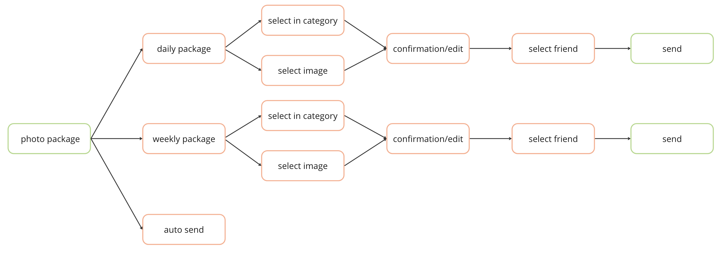
User Flows
The visual branding strategy for this product is strategically designed to elicit sentiments of comfort and intimacy, providing users with a seamless and ethereal communication experience across vast distances. The overarching aesthetic objective is to prompt users to value and appreciate the individuals who have entered their lives and assumed significance.
Branding
Wireframe to Prototype
To evaluate the efficacy of my project, I conducted user testing sessions and solicited feedback from participants. By employing key design principles and capturing user input, I am able to discern areas where the project excels and identify opportunities for refinement and enhancement.
Usability Test
Revised Design
My proposition:
The product I am offering includes features designed to encourage people to connect with their friends and families more easily. These features have been developed to streamline the process of getting someone's attention. By utilizing these features, users can foster meaningful connections with their long-distance friends and family members, potentially leading to more in-depth conversations.
Connection energy bar:
Based on users' frequency of connection with their friends, the system would generate a "connection energy bar." When this bar is fully charged, it would unlock a quick photo snap feature for immediate communication with their friend.
Photo Package:
Users enjoy convenient and swift access to the "photo package" within their chat. This feature allows users to stay updated on their friends' and family members' lives through the package and respond accordingly.
Weekly/daily package:
Depending on the user's schedule and the depth of their relationships with friends and family, they have the option to select either a daily or weekly photo package delivery frequency. This feature is crafted to cater to individuals who may not capture an extensive number of photos in their daily lives but aspire to facilitate seamless connections.
Photo package organizer:
Sending a quick photo package is an effortless means of connecting with others. The application enhances the experience by efficiently filtering and organizing your recent life's photos.
NEXT STEP…
ENCOUNTERING MEANINGFUL CHALLENGES!
Overall, this project was both challenging and therapeutic. Researching the history and backgrounds of travel was inspiring; however, finding innovative ways to reinvent features that enhance people's travel experiences proved to be a challenging task.
Moreover, designing an app from scratch was an extremely rewarding experience. I had the opportunity to conduct research, interview users, analyze collected data, and create high-fidelity interfaces. Throughout the process, I learned that a successful product must be supported by qualitative data, a clear user flow, and extensive user feedback.


